
可可饮料海报设计
“MINIMAL DESIGN. PREMIUM COCOA ENERGY.”nCr…
分类
图像提示
场景
电商运营
使用量
0
好评率
99%
推荐模型
—
Prompt 提示词
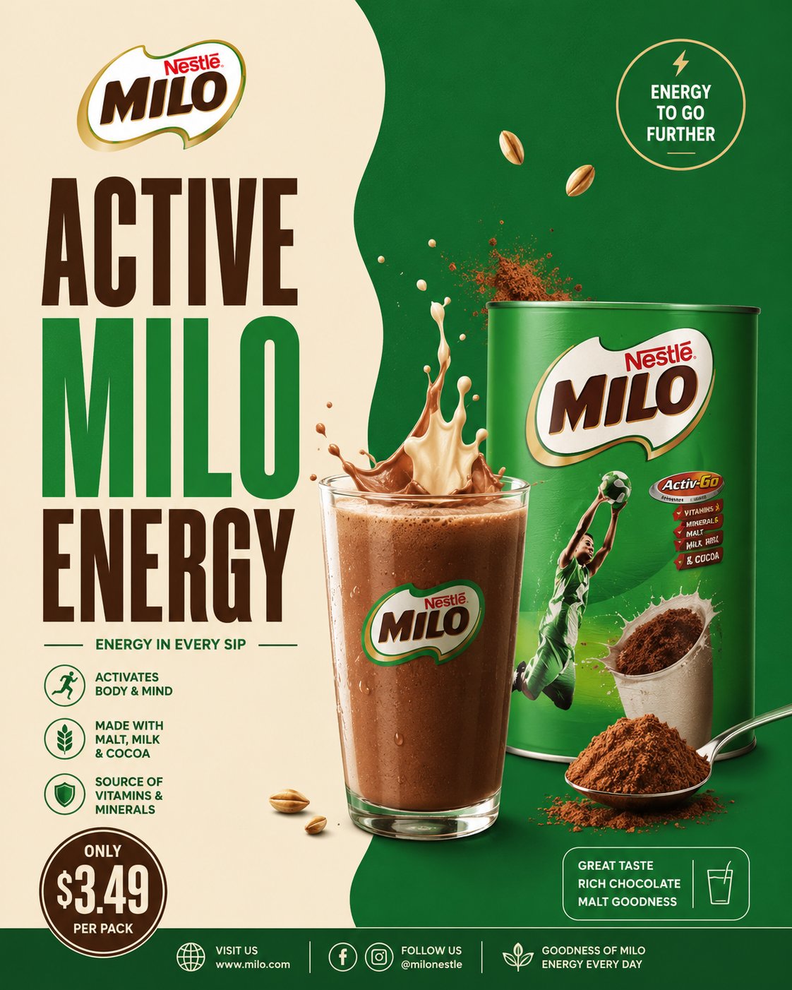
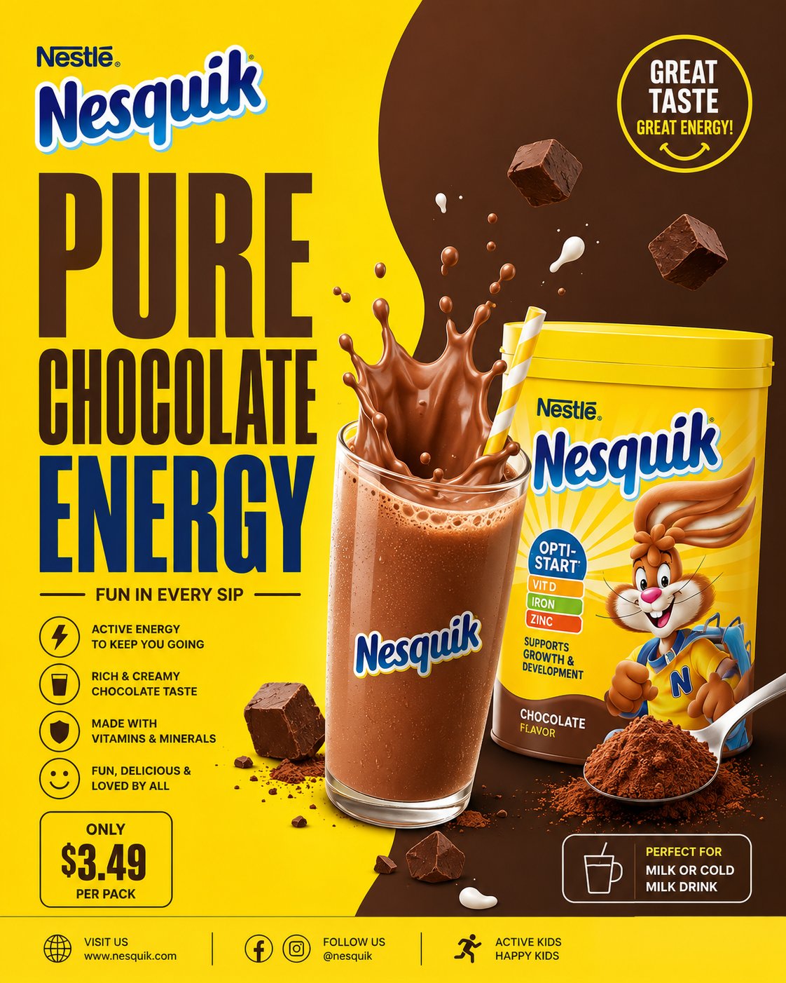
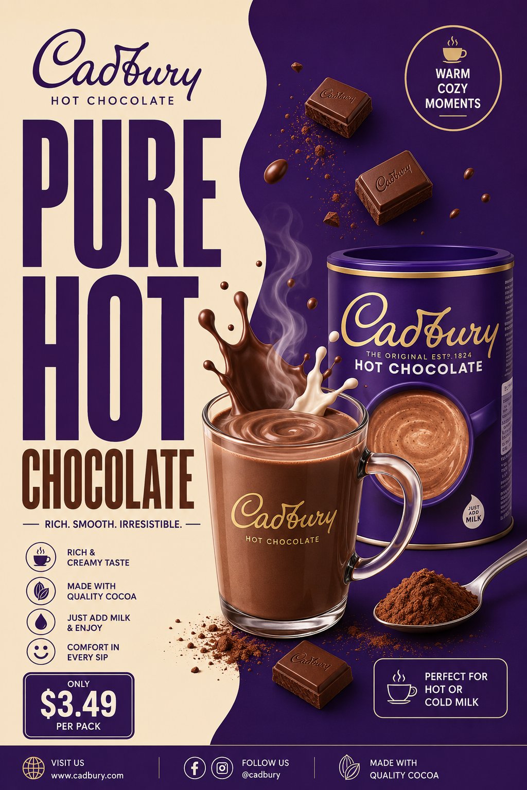
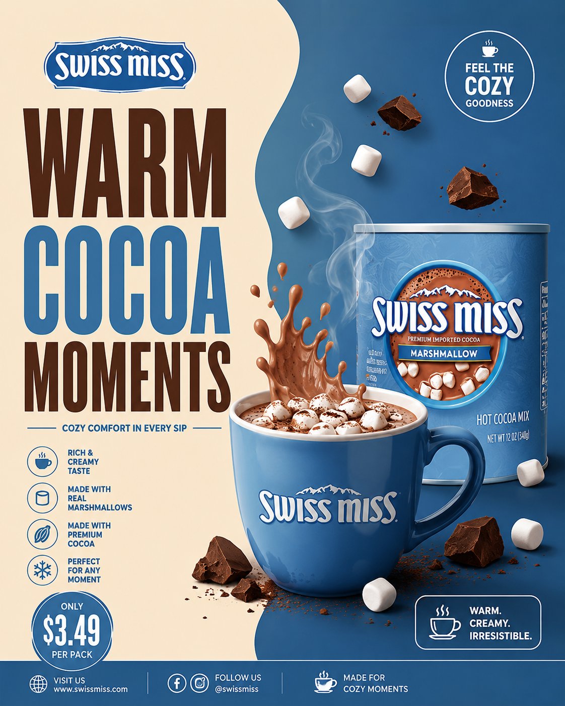
“MINIMAL DESIGN. PREMIUM COCOA ENERGY.”nCreate a premium minimalist FMCG poster for a [BRAND NAME] cocoa beverage inspired by retro-modern supermarket beverage ads, clean split-layout café posters, and modern FMCG commercial print campaigns.The poster should strongly resemble a minimal commercial advertisement with bold typography, smooth split-background composition, premium beverage styling, and clean editorial spacing.The design should feel:warm, creamy, cozy, modern, graphic, premium, commercial, organized, minimal, and visually pleasing.Avoid:n— cinematic realismn— chaotic splash explosionsn— cluttered floating ingredientsn— glossy 3D overloadn— busy café environmentsn— luxury black-and-gold overloadn— dark moody aestheticsn— excessive particles or effectsThe final result should resemble:a modern illustrated FMCG cocoa beverage campaign poster.CORE LAYOUT STYLEnCreate a vertical 4:5 poster with:— smooth split-background compositionn— oversized stacked typographyn— centered hero cocoa drinkn— minimal floating ingredientsn— clean promotional UI blocksn— geometric spacingn— strong negative spacen— balanced commercial hierarchyThe layout should feel:minimal, clean, bold, organized, and premium.MOST IMPORTANT FEATURE — SPLIT BACKGROUND SYSTEMnCreate a smooth organic TWO-TONE split background inspired by modern café posters.LEFT SIDEnUse lighter tones such as:— creamn— warm beigen— vanillan— milk tonesn— soft ivoryRIGHT SIDEnUse darker brand-supporting cocoa tones such as:— chocolate brownn— mochan— cocoa tonesn— caramel brownn— deep brand color accentsThe split curve should feel:smooth, fluid, elegant, soft, and modern.Use only:n— subtle gradientsn— soft shadowsn— faint glow accentsAvoid:n— dramatic texturesn— smoke overloadn— cinematic lightingn— heavy depth-of-field blurThe background should remain:flat, clean, airy, and commercially polished.TYPOGRAPHY (MOST IMPORTANT)nUse HUGE ultra-bold condensed sans-serif typography occupying 40–50% of the composition.Font inspiration:n— Bebas Neuen— Antonn— Oswald Boldn— Druk Condensedn— League GothicTypography should feel:bold, retro-modern, commercial, premium, and FMCG-focused.HEADLINE EXAMPLESn“PUREnCOCOAnCOMFORT”“RICHnCHOCOLATEnENERGY”“WARMnEVERYnSIP”“CREAMYnCOCOAnMOMENTS”“SMOOTHnHOTnCHOCOLATE”Typography styling:n— tight spacingn— strong vertical stackingn— clean alignmentn— minimal captionsn— thin divider linesn— simple white or cream textAvoid:n— decorative fontsn— handwritten typographyn— playful bubble fontsn— luxury serif overloadHERO DRINK COMPOSITIONnCreate a semi-realistic cocoa beverage with minimalist commercial styling.Possible setups:n— transparent glass mugn— ceramic cocoa cupn— iced cocoa glassn— creamy hot chocolate drinkn— chocolate milkshake style beverageInclude:n— rich creamy cocoa texturen— smooth milk splash arcsn— glossy highlightsn— subtle steam curvesn— chocolate swirl motionn— clean liquid reflectionsThe rendering should resemble:premium vector-commercial FMCG artwork.NOT cinematic realism.FLOATING ELEMENTSnAdd only a FEW controlled floating elements.Examples:n— cocoa powdern— chocolate chunksn— milk dropletsn— soft splash curvesn— marshmallowsn— cocoa spoonn— subtle steam ribbonsKeep everything:
organized, intentional, balanced, and minimal.Avoid chaotic particle explosions.PRODUCT PACKAGINGnInclude realistic [BRAND NAME] cocoa packaging naturally integrated into the composition.Packaging should:n— maintain the brand’s recognizable colorsn— feel clean and slightly glossyn— resemble real supermarket packagingn— remain secondary to the hero drinkPlacement ideas:n— lower foregroundn— beside the cupn— slightly overlapping typographyn— integrated subtly into splash motionDo not overpower the layout.PROMOTIONAL UI ELEMENTSnInclude minimal poster-style UI elements such as:— circular promo badgen— outlined price boxn— small cocoa iconn— thin divider linesn— clean footer stripn— minimal benefit iconsDesign style:n— flat graphic stylingn— white outlinesn— compact typographyn— minimal cluttern— editorial spacing

LIGHTINGnUse soft commercial studio lighting with:— nsmooth highlightsn— soft reflectionsn— minimal shadowsn— flat premium renderingn— clean beverage shineAvoid:n— dramatic cinematic contrastn— moody shadowsn— heavy atmospheric lightingThe lighting should resemble:
modern FMCG print advertising.

COLOR SYSTEMnUse only 3–4 dominant colors.

UNIVERSAL BASEn— cream / ivoryn— chocolate brownn— cocoa tonesn— whiteADD BRAND COLOR ACCENTSnExamples:n— Cadbury purplen— Nesquik yellown— Milo greenn— Swiss Miss bluen— Galaxy caramel brow

Colors should feel:
coordinated, warm, commercial, minimal, and print-ad ready.

COMPOSITION RULESnLayer Order:Split backgroundnOversized typographynCocoa splash motio

Hero beveragenFloating ingredientsnProduct packagingnPromotional UI blocksnFooter strip

Everything should feel:
balanced, minimal, premium, clean, and visually easy to read.Avoid visual overload.

FINAL VISUAL STYLEnThe final poster should look like:— modern FMCG print advertisingn— minimalist supermarket beverage campaignsn— retro-modern café postersn— commercial vector-realism hybrid artworkn— Instagram-ready commercial designNOT cinematic luxury advertising.

FINAL QUALITYnMinimal premium FMCG cocoa poster aesthetic.
Split-layout commercial composition.
Huge condensed typography.
Semi-realistic vector-commercial rendering.
Controlled floating elements.
Clean editorial spacing.
High-detail commercial rendering.
Ultra-clean poster realism.Aspect Ratio: 4:5nUltra HDn8KnInstagram-ready FMCG campaign quality
使用说明
-
复制 Prompt
点击「一键复制」或手动选中代码框中的完整内容。
-
替换变量
将 {花括号} 中的占位符改为你的真实信息,保留结构与要求说明。
-
粘贴到 AI 工具
在 ChatGPT、Claude 等对话工具或 Midjourney 输入框中发送,按需要多轮微调。
评论讨论
暂无评论,欢迎分享你的看法。